Financial
Second Quarter 2026 Results
Capital One · 2026
A restrained, whitespace-heavy banking deck. Navy headlines on white pages with a single thin red arc echoing the swoosh; the design gets out of the way of the numbers.
Design System
Color Palette
Capital One Navy
#004977
Headlines / primary accent
Capital One Red
#D03027
Swoosh arc / emphasis
Ink
#1F1F1F
Primary text
Gray
#6E6E6E
Secondary text / footnotes
White
#FFFFFF
Backgrounds
Typography
- Headings
- Optimist (custom Capital One grotesque), medium weight; similar to Inter
- Body
- Optimist at regular weight, small and dense for tables
- Notes
- Navy titles on white; red never used for text, only the arc motif and chart deltas.
Visual Style
MinimalInstitutionalQuietData-first
Layout
White pages with small top-left logo, left-aligned navy headline, a thin red arc rule, and vast whitespace before content blocks.
Imagery
Almost none — the cover and dividers rely on type and the arc motif alone.
Charts & Data
Dense navy tables and simple bar trends with red reserved for callout deltas.
Frequently Asked Questions
- What colors does Capital One use in its presentations?
- Capital One's Q2 2026 Earnings (2026) uses a 5-color palette: Capital One Navy (#004977) for headlines / primary accent, Capital One Red (#D03027) for swoosh arc / emphasis, Ink (#1F1F1F) for primary text, Gray (#6E6E6E) for secondary text / footnotes, White (#FFFFFF) for backgrounds.
- What fonts does Capital One use in its slides?
- Headings: Optimist (custom Capital One grotesque), medium weight; similar to Inter. Body: Optimist at regular weight, small and dense for tables.
- What is the presentation design style of Capital One?
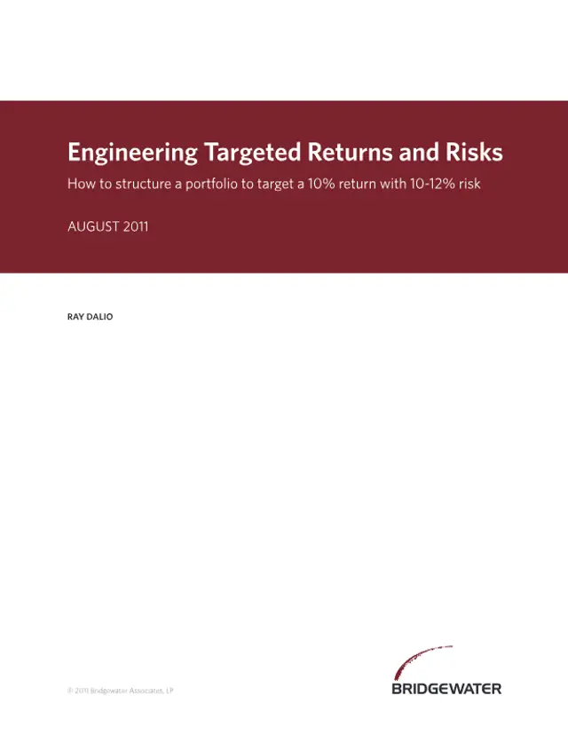
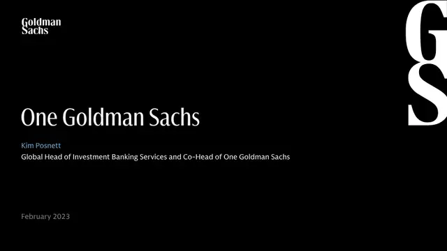
- The deck's visual style is minimal, institutional, quiet, data-first. White pages with small top-left logo, left-aligned navy headline, a thin red arc rule, and vast whitespace before content blocks.

Recreate this look in Plus AI
Download the design spec and generate a fully styled deck in minutes.